About Furniture Display
Designing a Typeface
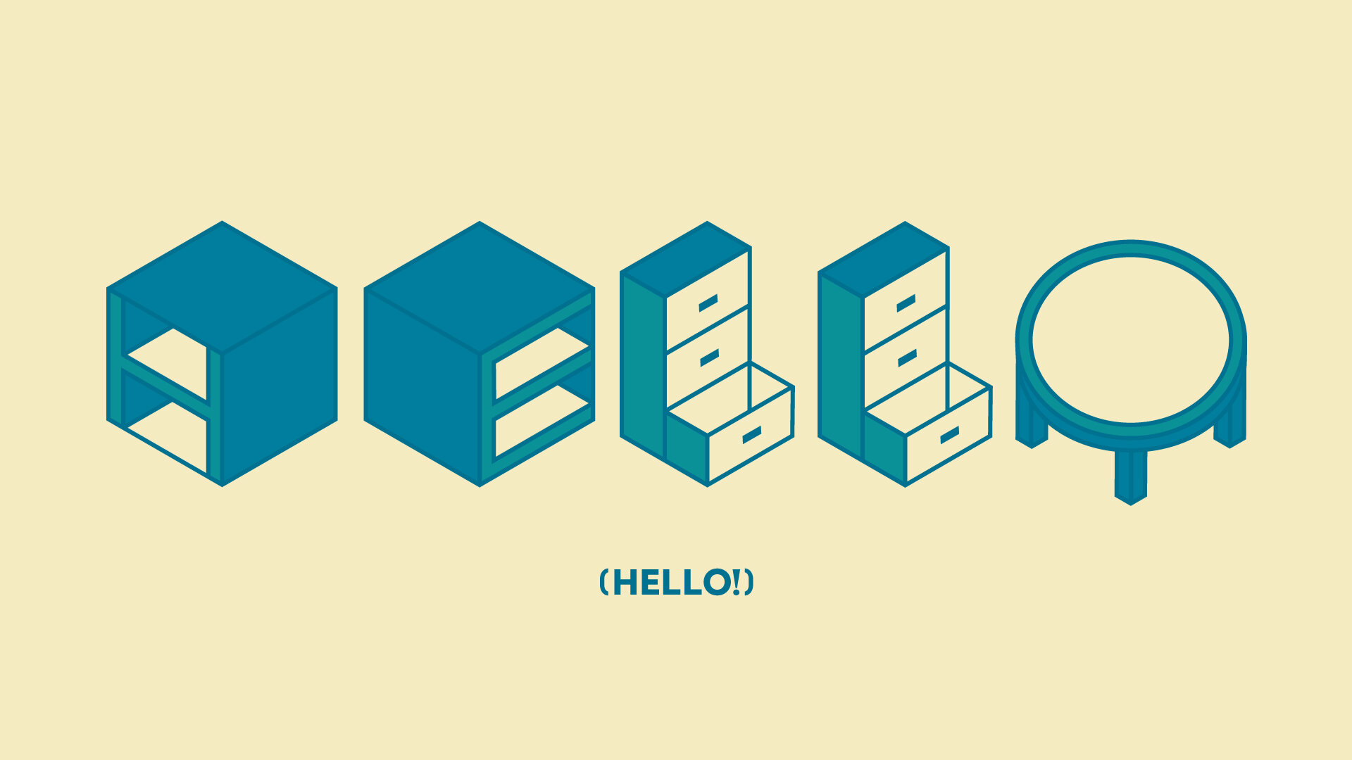
A typeface for all interiors, Furniture Display asks its users to consider how type transforms between two and three dimensions, as well as the shared need from type and furniture for a strong structure in order to function. Along with the type specimen is an abecedarium accordion book.
Inspired by the work of Wim Crouwel and modular typefaces, Furniture Display was created using an isometric grid and references the design aesthetics of Ikea and Knoll furniture in its structures and linework. A three color palette provided by Sanzo Wada’s A Dictionary of Color Combinations is used to show dimension.
Type Pairing
For body text, Acier Bat from the Production Type Foundry was chosen for its similarities to the custom type in structure, line, and color across multiple weights.

The Abecedarium
Format & Paper
Similar to the way the typeface considers the transformation between a two and three dimensional space, the accordion book is able to sit as a small block and shift into a long, space consuming structure as it’s read.
In terms of paper, a heavier weight was chosen based on the demands of folding and adhesives, with the color choice remaining in the palette.


